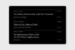
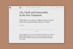
Conversatio Divina is an initiative of the Martin Institute for Christianity and Culture at Westmont College in Santa Barbara, California. The project to brand, design, and develop a website was initially kicked off to curate the writings and lectures of Dallas Willard, but quickly grew to include other voices centered around the teachings of Christ.
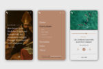
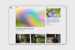
We began by creating a brand identity and designed and developed a custom website and app.
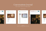
As we put pen to paper, the question we continuously asked ourselves was, “how do we bring the slow pace of character formation to this brand identity, but more specifically to a website experience?”
See the complete website at conversatio.org
With topics and material being so weighty on the site, we, along with the client, decided to move in a direction counter the trend in websites of serving up the next piece of content for the sake of engagement. Instead, everything from the aesthetics to the cadence and pacing of the literature, audio, and video is intended to block out noise and slow the audience down enough to ingest what they are consuming.

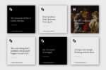
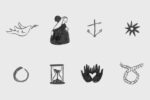
Single-color, hand-drawn spot illustrations and vignettes were developed for a touch of warmth, depth, and dimension for articles and page covers.